Custom components
Table of Contents
This theme includes some useful custom components that you can use to enhance your posts. Whether you want to display images that adapt to light and dark themes, or format a professional-looking reference section, these custom components have got you covered. tabi’s reusable content helpers are Tera components. Use the self-closing or block forms shown in this guide. Mermaid is a a diagramming and charting tool that uses text and code to generate diagrams. It supports flowcharts, sequence diagrams, Gantt charts, and more. To include a Mermaid diagram in your post, there are two steps: Set Use the The diagram will be rendered as follows: The Mermaid component supports two parameters: You can use the Mermaid Live Editor to create and preview your diagrams. All image components support absolute paths, relative paths, and remote sources in the All image components have these optional parameters: Useful if you want to use a different image for the light and dark themes: Good for graphs, line drawings, diagrams… Inverts the colours of the image. The source image will be used for the light theme. Images with too much brightness or contrast can be jarring against a dark background. Here’s an example of a photograph that dims when the dark theme is active. Provides an interaction where the image displayed changes as the user hovers over it. Useful for before-after comparisons, for example. Display an image and switch to a different one on click. Ideal for highlighting differences or drawing attention to details. The image will expand to match the width of the header, which is usually wider than the article text (except on mobile/small windows). All other image components can be made into full-width by setting the optional parameter This component allows you to add extra iine.to buttons to your posts, like this: The component takes the following optional parameters: You can display a path or URL for a code block using Zola’s native syntax: This renders: If you set the The clickable URL feature requires JavaScript. To enable it, set Add supplementary content in the margins on wide screens, or as distinct blocks on mobile. The component accepts two parameters: Place the aside component on its own line to prevent formatting issues. Using the Using the content body and setting the position to right: Embed text from a remote URL or a local file. To display the path or URL on the code block, see the show source or path component. The component accepts three parameters: Important: Embedding a remote Python script within a code block with syntax highlighting: Displaying text from a local file: Display lines 3 to 7 (both inclusive) of a local file: Bring attention to information with these admonition/alert components. They come in five Some content with Markdown Some content with Markdown Some content with Markdown Some content with Markdown Some content with Markdown You can change the Some content with Markdown You can use admonitions in two ways: Both methods support the same parameters ( This component allows you to display both the translated and original text for a quote. The quotation marks will be added automatically: “What tranquillity, to go through life in silence, greeting only friends.” — Francisco Umbral “Qué sosiego, ir por la vida en silencio, saludando sólo a los amigos.” — Francisco Umbral This component formats a reference section with a hanging indent like so: Alderson, E. (2015). Cybersecurity and Social Justice: A Critique of Corporate Hegemony in a Digital World. New York Journal of Technology, 11(2), 24-39. https://doi.org/10.1007/s10198-022-01497-6. Funkhouser, M. (2012). The Social Norms of Indecency: An Analysis of Deviant Behavior in Contemporary Society. Los Angeles Journal of Sociology, 16(3), 41-58. https://doi.org/10.1093/jmp/jhx037. Schrute, D. (2005). The Beet Farming Revolution: An Analysis of Agricultural Innovation. Scranton Agricultural Quarterly, 38(3), 67-81. Steinbrenner, G. (1997). The Cost-Benefit Analysis of George Costanza: An Examination of Risk-Taking Behavior in the Workplace. New York Journal of Business, 12(4), 112-125. Winger, J. A. (2010). The Art of Debate: An Examination of Rhetoric in Greendale Community College’s Model United Nations. Colorado Journal of Communication Studies, 19(2), 73-86. https://doi.org/10.1093/6seaons/1movie. This component allows you to blur text until the user clicks on it. Like this: Goldfish have a memory span of a few As you can see, Markdown is rendered. You can even add newlines with This component has the optional flag Use this component if you want to have a wider table, paragraph, code block… On desktop, it will take up the width of the header. It will have no effect on mobile, except for tables, which will get a horizontal scroll. Force the text direction of a content block. Overrides both the global Accepts the parameter In a LTR page we can force a code block to be RTL (as shown above) like so: Diagram component
Mermaid diagrams
mermaid = true in the [extra] section of the front matter of your page, section or config.toml. This will load the JavaScript needed to render the diagrams.mermaid component to define your diagram in your posts. For example:{% <mermaid> %}
classDiagram
    class CognitiveDistortions {
        +AllOrNothingThinking()
        +Overgeneralization()
        +MentalFilter()
        +JumpingToConclusions()
    }
    class AllOrNothingThinking {
        +SeeInExtremes()
    }
    class Overgeneralization {
        +GeneralizeFromSingle()
    }
    class MentalFilter {
        +FocusOnNegative()
    }
    class JumpingToConclusions {
        +MakeAssumptions()
    }
    CognitiveDistortions *-- AllOrNothingThinking
    CognitiveDistortions *-- Overgeneralization
    CognitiveDistortions *-- MentalFilter
    CognitiveDistortions *-- JumpingToConclusions
{% </mermaid> %}
classDiagram
class CognitiveDistortions {
+AllOrNothingThinking()
+Overgeneralization()
+MentalFilter()
+JumpingToConclusions()
}
class AllOrNothingThinking {
+SeeInExtremes()
}
class Overgeneralization {
+GeneralizeFromSingle()
}
class MentalFilter {
+FocusOnNegative()
}
class JumpingToConclusions {
+MakeAssumptions()
}
CognitiveDistortions *-- AllOrNothingThinking
CognitiveDistortions *-- Overgeneralization
CognitiveDistortions *-- MentalFilter
CognitiveDistortions *-- JumpingToConclusions
invertible: If set to true (default), the diagram will be inverted in dark mode, just like invertible images.full_width: Allows the diagram to take up the width of the header. See full-width image. Usage
{% <mermaid invertible={true} full_width={false}> %}

Your diagram goes here.

`invertible` or `full_width` can be omitted if default values are used.

{% </mermaid> %}
Image components
src parameter.raw_path. Defaults to false. If set to true, the src parameter will be used as is. Useful for colocated assets with a custom slug (see Zola issue #2598).inline. Defaults to false. If set to true, the image will be displayed inline with the text.full_width. Defaults to false (see below)lazy_loading. Defaults to true. Dual theme images


Usage
{{< dual_theme_image light_src="img/paris_day.webp" dark_src="img/paris_night.webp" alt="The Eiffel tower" />}} Invertible image
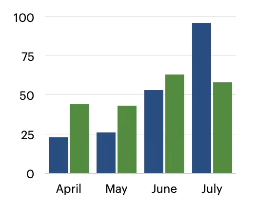
Usage
{{< invertible_image src="img/graph.webp" alt="Invertible graph" />}} Dimmable image

Usage
{{< dimmable_image src="img/desert_by_oskerwyld.webp" alt="Photograph of a desert, heavenly sky" />}} Swap image on hover


Usage
{{< image_hover default_src="img/before.webp" hovered_src="img/after.webp" default_alt="Edited picture" hovered_alt="Original shot" />}} Interactive image toggle
Usage
{{< image_toggler default_src="img/mojave_day.webp" toggled_src="img/mojave_night.webp" default_alt="Mojave during the day" toggled_alt="Mojave at night" />}} Full-width image
full_width to true.
Usage
{{< full_width_image src="img/amsterdam_by_oskerwyld.webp" alt="Photograph of a canal in Amsterdam" />}} Engagement components
iine
Usage
{{< iine icon="heart" slug="/post/my-post-slug/like" label="Like this post" />}}icon: The icon to display. Can be heart, thumbs_up, upvote, or any emoji.slug: A unique identifier. Defaults to the current page’s path. Useful if you want more than one button on the same page.label: The accessibility label for the button. Defaults to “Like this post”. Code components
Show source or path
```rust,name=src/main.rs
fn main() {
    println!("Hello, world!");
}
```fn main() {
println!("Hello, world!");
}name to a URL (i.e. it starts with http or https), you can turn it into a clickable link. This is particularly useful when used in conjunction with the remote text component.code_block_name_links = true on the [extra] section of your page, section, or config.toml.__pycache__/
*coverage*
.vscode/
dist/ Text components
Aside (side/margin note)
position: Set to "right" to place in right margin (defaults to left)text parameter or between component tags Usage
text parameter:{{< aside text="*Sidenote* comes from Latin *nota* ('mark') + Old English *síde* ('side')." />}}{% <aside position="right"> %}
A longer note that
can span multiple lines.
_Markdown_ is supported.
{% </aside> %} Remote text
src: The source URL or file path (required)start: First line to display (optional, starts at 1)end: The ending line number (optional, defaults to 0, meaning the last line)start and end are inclusive. start=3, end=3 will display only the third line.src starts with “http”, it will be treated as a remote file. Otherwise, it assumes a local file path.load_data, local files must be inside the Zola directory—see File searching logic. The component supports both relative and absolute paths. Usage
```python
{{< remote_text src="https://example.com/script.py" />}}
```{{< remote_text src="path/to/file.txt" />}}{{< remote_text src="path/to/file.txt" start={3} end={7} />}} Admonitions
types: note, tip, info, warning, and danger.syntax. Check this api.syntax. Check this api.syntax. Check this api.syntax. Check this api.syntax. Check this api.title and icon of the admonition. Both parameters take a string and default to the type of admonition. icon can be any of the available admonition types.syntax. Check this api. Usage
{{< admonition type="danger" icon="tip" title="An important tip" text="Stay hydrated~" />}}{% <admonition type="danger" icon="tip" title="An important tip"> %}
Stay hydrated~
This method is particularly useful for longer content or multiple paragraphs.
{% </admonition> %}type, icon, and title), with the content either passed as the text parameter or as the body between tags. Multilingual quotes
Usage
{{< multilingual_quote original="Qué sosiego, ir por la vida en silencio, saludando sólo a los amigos." translated="What tranquillity, to go through life in silence, greeting only friends." author="Francisco Umbral" />}} References with hanging indent
Usage
{% <references> %}

Your references go here.

Each in a new line. Markdown (links, italics…) will be rendered.

{% </references> %}
Spoiler
<br>.fixed_blur to blur a fixed placeholder (“SPOILER”), instead of blurring the actual contents. Like this: it is Usage
{{< spoiler text="text to hide" fixed_blur={false} />}} Containers
Wide container
Title Year Director Cinematographer Genre IMDb Duration Beoning 2018 Lee Chang-dong Hong Kyung-pyo Drama/Mystery 7.5 148 min The Master 2012 Paul Thomas Anderson Mihai Mălaimare Jr. Drama/History 7.1 137 min The Tree of Life 2011 Terrence Malick Emmanuel Lubezki Drama 6.8 139 min Usage
{% <wide_container> %}

Place your code block, paragraph, table… here.

Markdown will of course be rendered.

{% </wide_container> %}
Force text direction
force_codeblock_ltr setting and the document’s overall direction.direction: the desired text direction. This can be either “ltr” (left-to-right) or “rtl” (right-to-left). Defaults to “ltr”.def مرحبا_بالعالم():
print("مرحبا بالعالم!") Usage
{% <force_text_direction direction="rtl"> %}
```python
def مرحبا_بالعالم():
    print("مرحبا بالعالم!")
```
{% </force_text_direction> %}